Candlestick Charting
Candlestick charts have been around for hundreds of years. They are often referred to as "Japanese Candles" because the Japanese would use them to analyze the price of rice contracts.
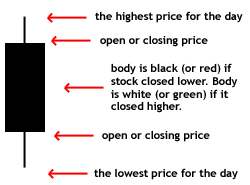
Similar to a bar chart, candlestick charts also display the open, close, daily high, and daily low. The difference is the use of color to show if the stock was up or down over the day.
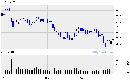 This chart was supplied by BigCharts.com
Candlestick charts have a "love or leave" relationship with investors. People either love candlesticks and use them frequently, or are completely turned off by them.
There are several patterns people look for with candlestick charts, here are a few of the popular ones and what they mean:
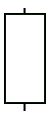

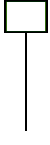
Keep in mind there are over 20 other patterns used by technical analysts for candlestick charting.
Now, let's take a look at a more traditional style of charting stock price performance called "Point & Figure Charting."