Using Bollinger Bands
There are three lines used for the Bollinger Band indicator: the upper, lower, and the simple moving average that is between the two (sometimes this third line is not used). The upper/lower bands are plotted two standard deviations away from a simple moving average. Standard deviation is a measure of volatility, therefore Bollinger Bands adjust themselves to the market conditions. When the markets become more volatile, the bands widen and they contract during less volatile periods.
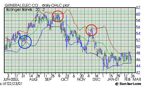
The closer the prices move to the upper band, the more overbought the stock is. The closer the prices move to the lower band, the more oversold the stock is. Below is an example using General Electric (GE). Bollinger bands are blue for the lower, green for the average, and red for the upper band:
 This chart was supplied by Barchart.com
We have circled three key points on this chart. The blue circle is where the stock price started to create a "base" on the lower band, it appeared that the stock was oversold. Buying at this point would have been a wise choice, as the stock proceeded to jump 20% or more in the next few weeks.
The two red circles are areas where the stock price was touching or breaking through the upper red band. This is usually an indication that the stock is overbought. In both instances, the stock dropped substantially in following weeks.
Bollinger Bands are a good tool to use, but as we've mentioned before, never invest solely based on what just one indicator says. Notice there were instances when the stock touched the upper or lower band and did not react. Rather than basing their investment decisions on Bollinger Bands, many investors use this indicator mainly to solidify a decision they are about to make.